Apple's New Design Language - WWDC25
Peter Yaacoub •


Apple’s latest design updates represent a new era of consistency and continuous refinement in their ecosystem, showing a strong emphasis on fluidity, clarity, and adaptability across all platforms.
Meet Liquid Glass
Liquid Glass is Apple’s newest material, a direct evolution of the Mac OS X Aqua design and iOS 7 translucency. It embraces the best of flat and skeuomorphic designs with a metamaterial aesthetic that feels organic. Unlike older effects and animations, Liquid Glass uses optical depth and dynamic morphing, for example, when a button transforms into a menu or one view morphs into another.
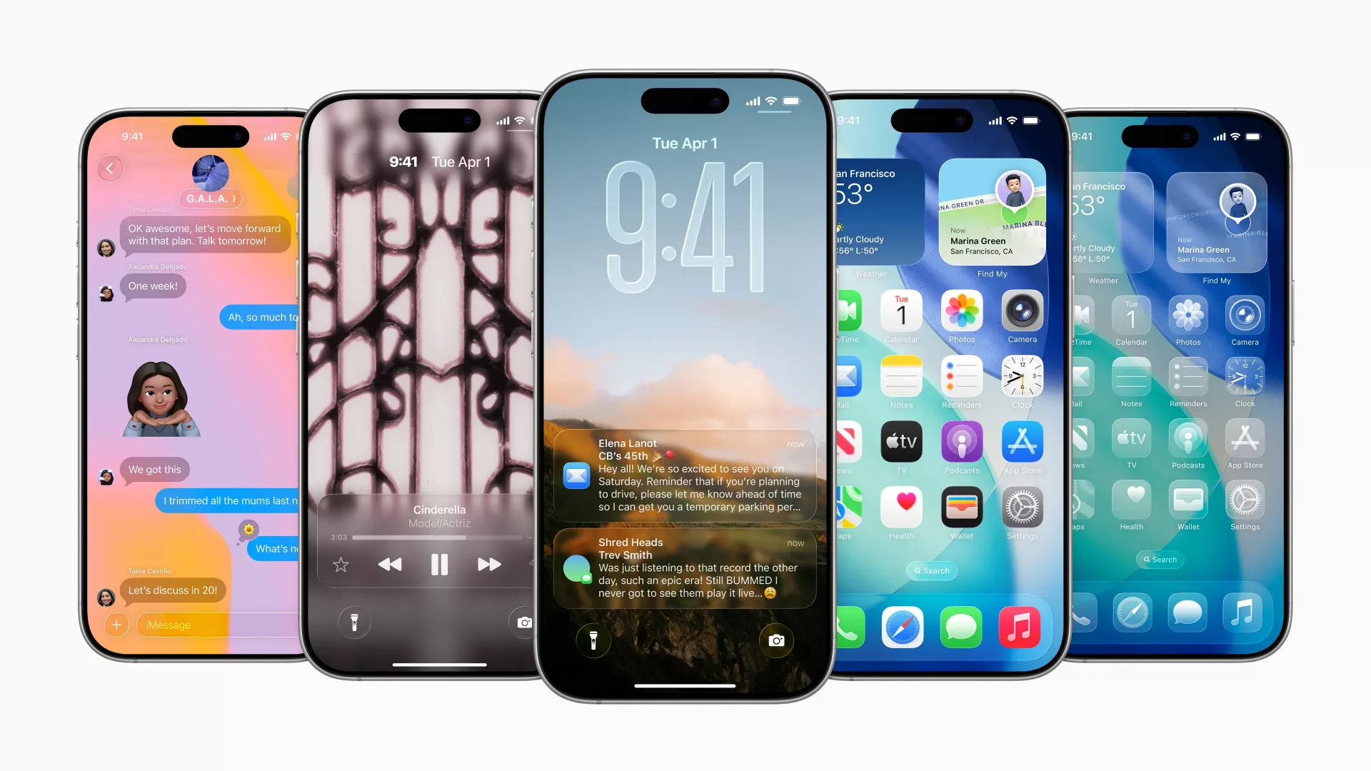
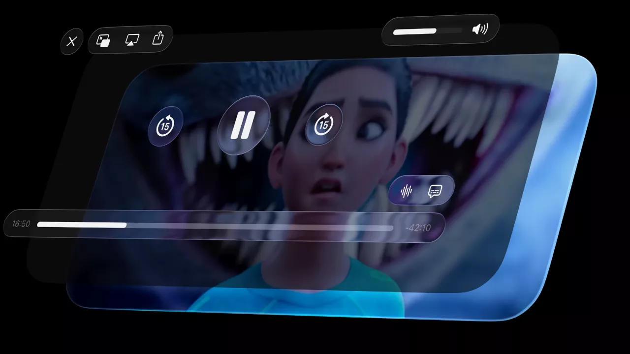
All the glass and transparency effects can make legibility feel worse. However, it is evident that Apple has it at the core of the system. Shadows, a wide dynamic range, and careful use of light and dark modes ensure text and elements remain clear against any background. The system defines two functional layers: a content layer underneath and a functional interface layer on top, connected by blur effects, hard-edge styles, and scroll-edge interactions.
Highlights and shadows add dimensionality, with a normal state and a grayed-out inactive state. Designers are encouraged to use Liquid Glass primarily for navigation. They should avoid layering multiple glass panels together, which can compromise clarity. Apple also distinguishes between Regular and Clear variants: Regular is used in most interface contexts, while Clear is designed for media-rich backgrounds or bold, bright content that benefits from a dimming layer. Sparse tinting can provide emphasis, but the intersection of elements should be avoided in steady states. Importantly, Liquid Glass respects all accessibility settings.
Get to Know the New Design System
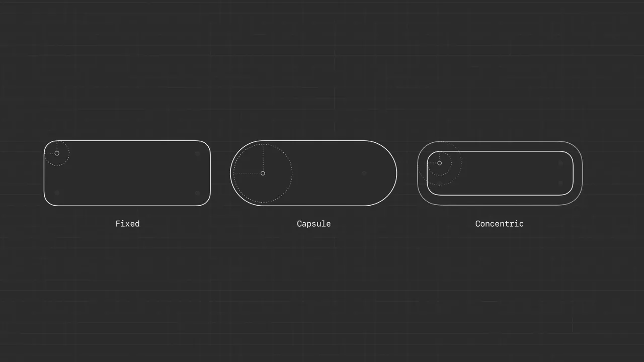
Apple’s broader design system has been updated with three pillars in mind: language, structure, and continuity. System colors have been refreshed to be bolder and more legible, and typography is now consistently left-aligned across interfaces. Borders and radii follow consistent rules: fixed corners for standard components, capsule radii for pill-shaped controls, and concentric radii that scale naturally with parent elements and padding.
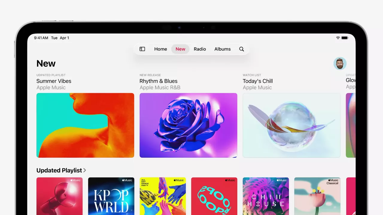
Navigation and content separation are streamlined. Action sheets now rise from the bottom and point directly to their source, while scroll views feature a single edge effect per view for clarity. Menus emphasize text labels with optional icons, reducing reliance on symbolic shorthand. Apple encourages a platform-adaptive approach: a single view on iPhone, collapsible sidebar and split view navigation on iPad, and sidebar and split view navigation on Mac, all powered by the same underlying decision.
This system aims to reduce redundancy while providing a consistent cross-platform identity. By simplifying grouping, prioritizing layout, and ensuring consistent navigation patterns, designers can build interfaces that feel native on each device without reinventing the wheel.
Elevate the Design of Your iPad App
On iPad, design enhancements focus on navigation, windows, the pointer, and the menu bar. Navigation now offers more flexibility, starting with sidebars that can collapse into tab bars, adapting to context without losing content. Layout changes are non-destructive, so resizing or rotating does not force users to relearn controls. Window controls are now at the leading edge of the toolbar, aligning with macOS conventions and removing unnecessary safe area padding. Each new document can now also open in its own window with descriptive titles, improving multitasking.
Pointer interactions remain central to iPadOS. Apple distinguishes between default menus, which cover common system actions like tab navigation and sidebar toggling, and custom menus, where developers can surface their app’s most relevant features. Custom menus should be populated fully, ordered by frequency, grouped into logical sections, and paired with symbols. The most common actions should be assigned keyboard shortcuts. Importantly, Apple emphasizes never hiding menus or actions based on context. Disabled states are preferable and maintain a predictable interface for users.
Say Hello to the New Look of App Icons
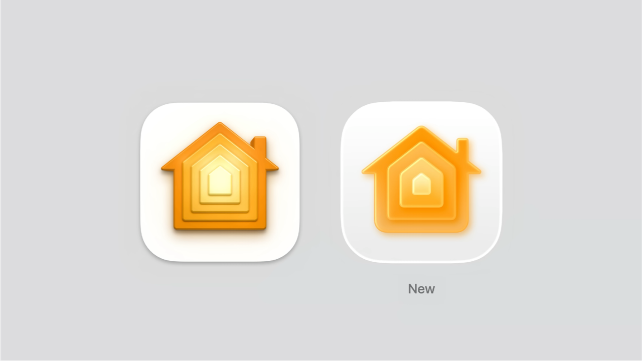
Apple has also rethought how app icons integrate into the system, offering new modes: icons can now appear in translucent light or dark and tinted light or dark modes.
The design grid has been refined for both squircles and circles, with rounder corner radii across platforms. Within icons, designers are encouraged to avoid sharp edges, increase line weights for clarity at smaller sizes, and embrace gradients. A typical icon now uses a gradient that shifts from light at the top to dark at the bottom. Backgrounds adapt as well: colorful in normal mode, darker in dark mode, with translucent variations on request.
Create Icons with Icon Composer
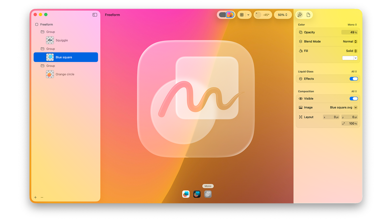
Apple has consolidated its icon creation pipeline with the new Icon Composer, integrated into Xcode. Historically, developers needed to manage multiple icons per platform. Then came per-platform consolidation. Now, with Icon Composer, a single source can generate all required icon variants across devices.
Icon Composer provides a default specular highlight for depth, but also allows fine control over blur, shadow, specular intensity, opacity, translucency, and masking. Designers should limit designs to four groups for simplicity and avoid overusing highlights or Liquid Glass on text. Chromatic shadows work well for colored icons against light backgrounds. For legibility in dark mode, use monochrome shadows.
The workflow integrates seamlessly with Apple’s design templates for Figma, Sketch, Photoshop, and Illustrator. Developers can export icons with backgrounds, outlines, and per-layer SVG or PNG assets, or rely on Icon Composer for common gradients and fills. The end result is greater consistency across platforms and less manual overhead.
A fluid and coherent ecosystem
Liquid Glass brings depth and organic transitions. The updated design system strengthens cross-platform consistency. iPad apps gain more flexibility with windows and menus. New icon styles harmonize apps with the system. Icon Composer reduces friction in delivering polished icons. Together, these updates point to Apple’s long-term vision for its products and its ever-increasing interest in Augmented Reality.